CASE STUDY
BRIEF
Greenpark had cultivated a loyal clientele through a distinctly personal style of hospitality — where preferences are remembered, gestures are thoughtful, and each stay feels tailored to the individual guest. However, the existing identity no longer reflected the contemporary positioning the hotel aspired to occupy.
In a market dominated by global hospitality chains, Greenpark sought a distinctive voice that would emphasise its individuality while retaining its warmth and familiarity. The brief was therefore twofold — to modernise the brand’s visual language, and articulate a positioning that clearly distinguishes it from the homogenised aesthetics of international hotel brands.
STRATEGY
Brand Pillars
At the heart of the repositioning is a clear cultural framework — ‘The Spirit of Greenpark’. These pillars define the ethos of the brand’s hospitality, and form the strategic foundation of the identity system.
From the Heart: Intuitive and personal — shaped by genuine attentiveness to each guest.
Guest First: Every aspect of the experience, from service to spatial design, is guided by a singular focus on the guest.
Keep it Special: Small, thoughtful gestures — remembered preferences and personal touches — make each stay memorable.
A Brand for All: Welcoming and inclusive — warm and accessible.
Stay Fresh: Rooted in legacy, yet continually evolving — contemporary in outlook, and grounded in authenticity.
Our People Matter: A culture that empowers its people — which in turn translates to an experience defined by personal connections.
Brand Promise
This cultural framework informed the articulation of the brand promise, ‘Stay Special’ — capturing the essence of Greenpark’s philosophy, and guiding the visual and experiential identity that followed.
DESIGN
Brand Mark & Brand Language
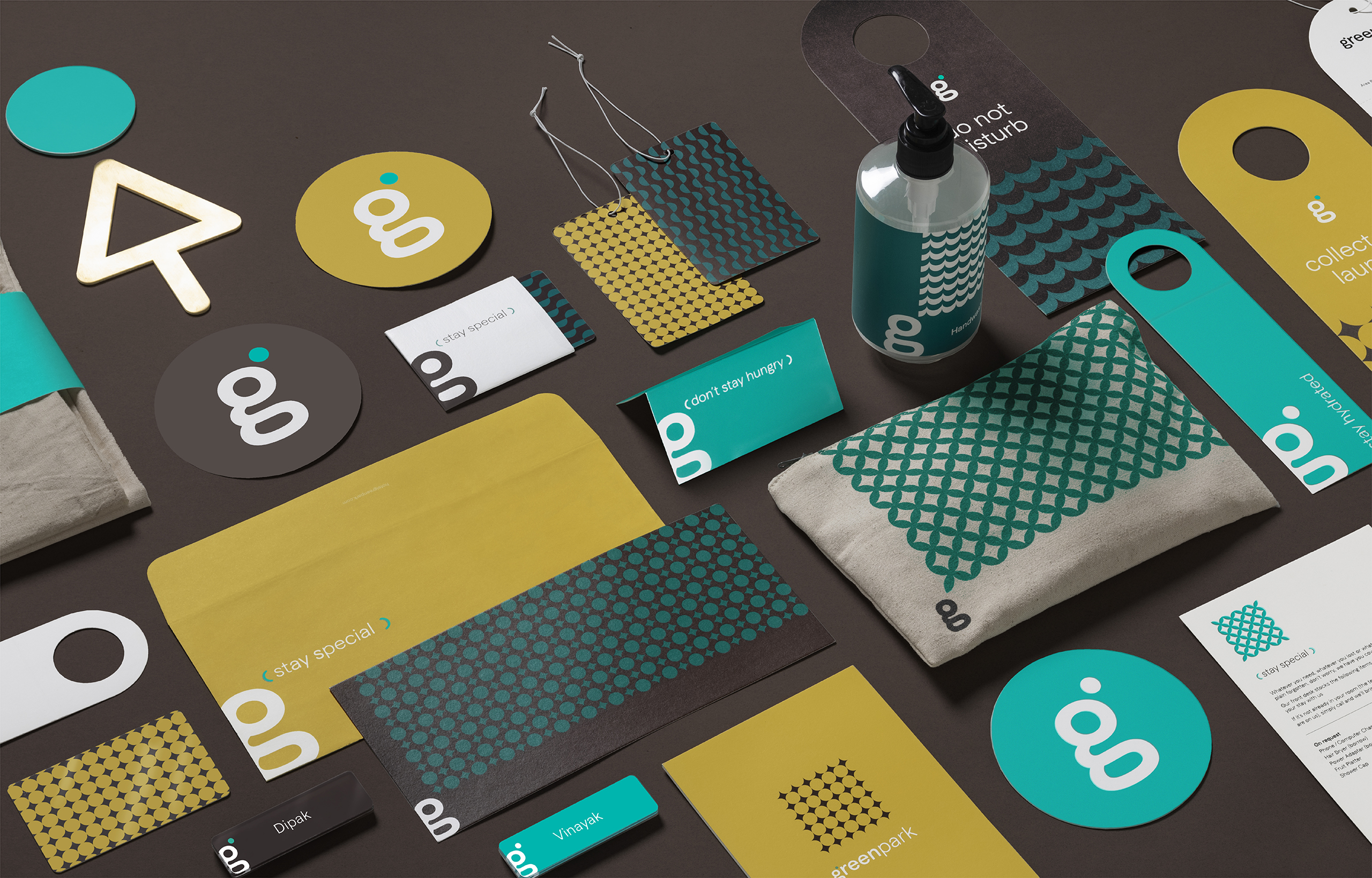
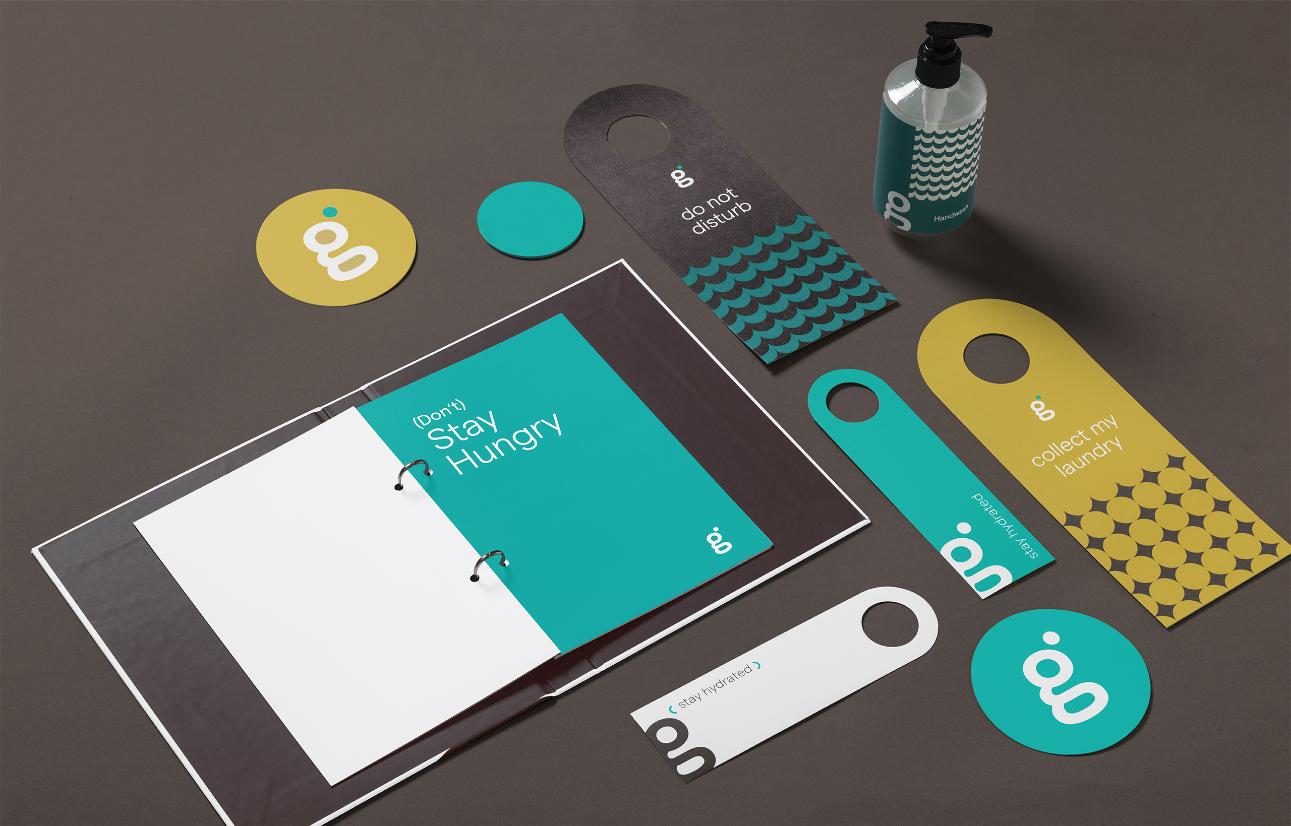
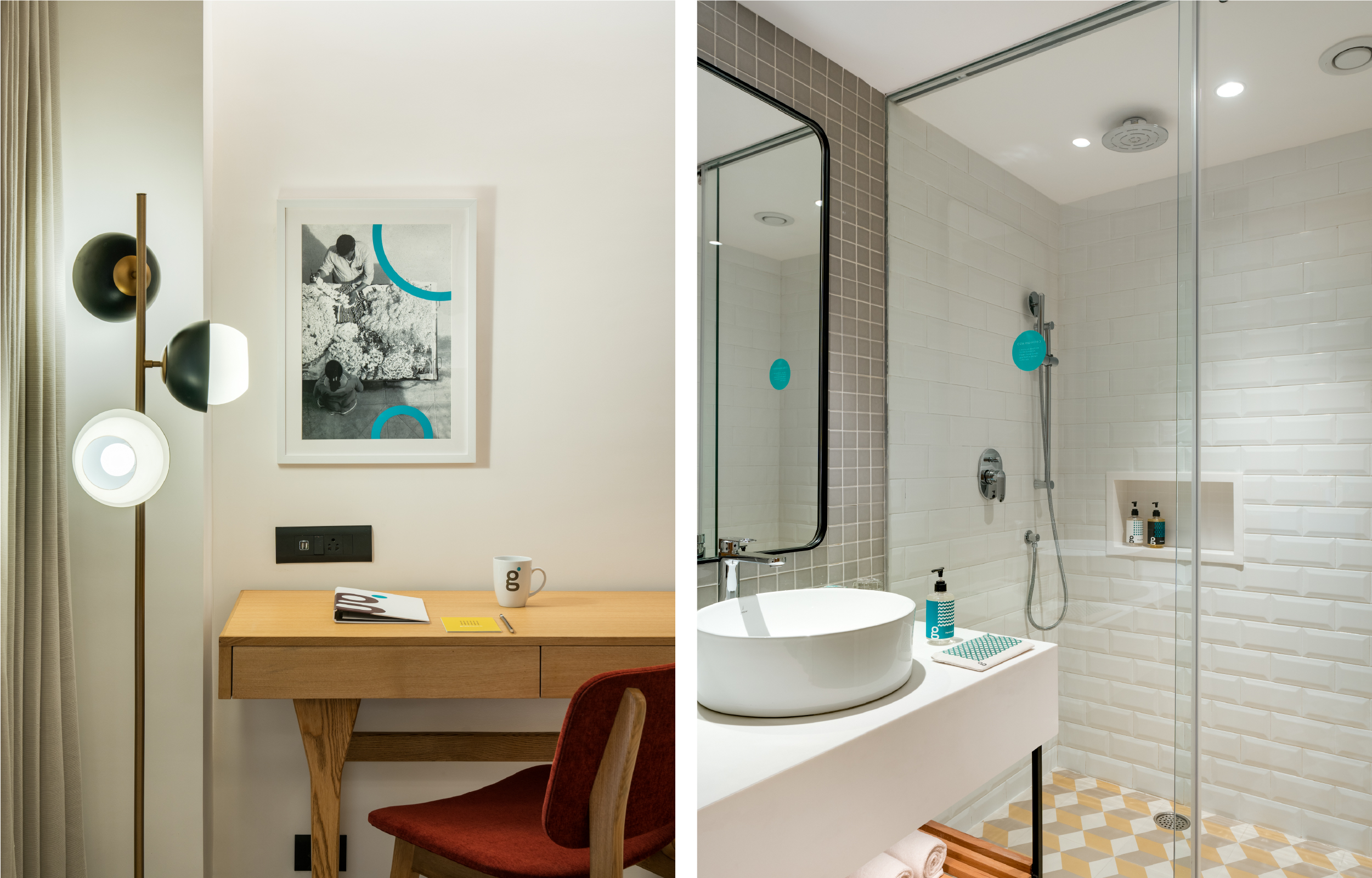
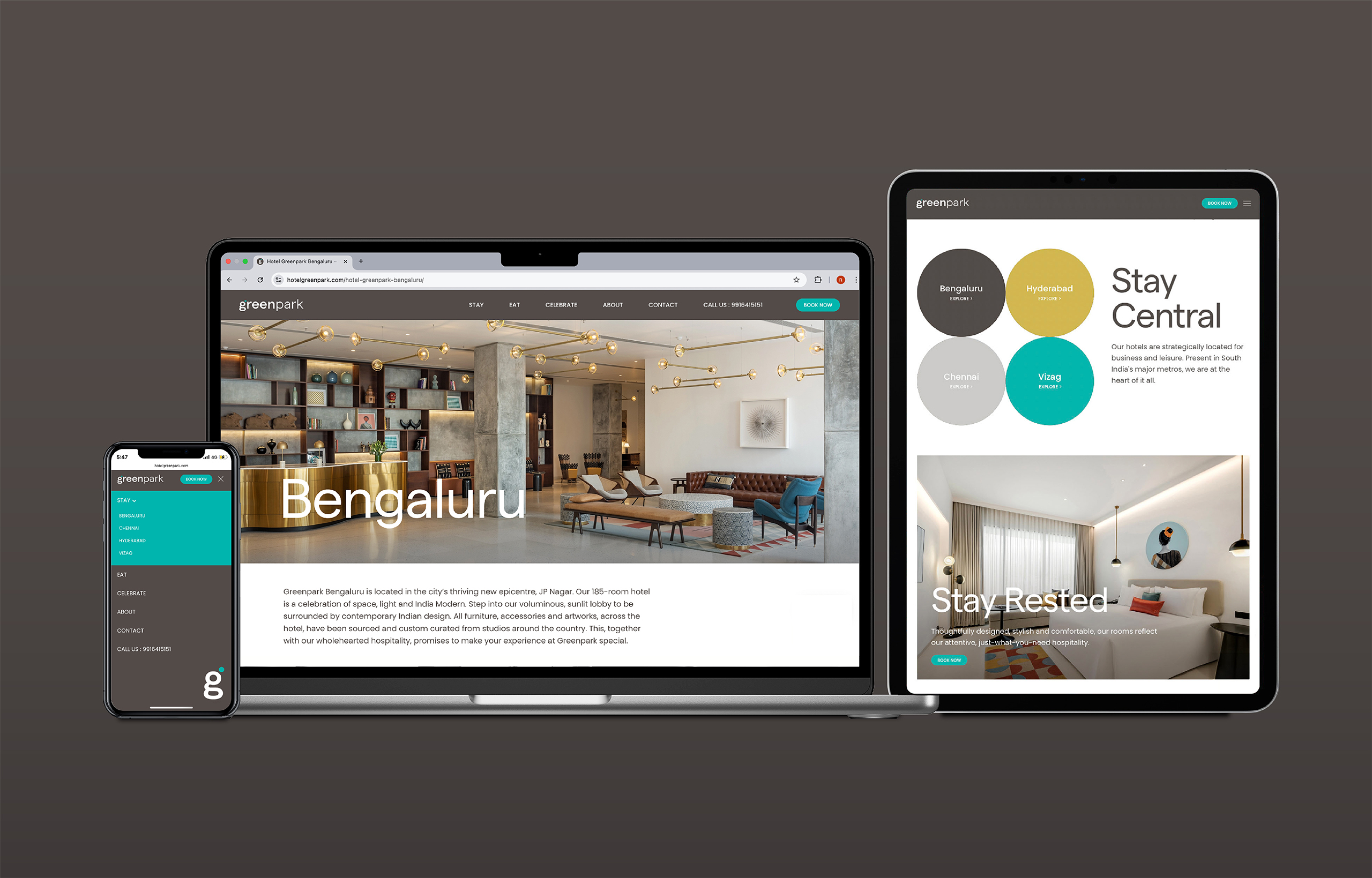
The identity translates the promise ‘Stay Special’ into a simple yet distinctive mark — a loop-tail lowercase ‘g’ anchored by a singular green dot. This subtle intervention becomes the central motif, symbolising small but meaningful gestures that define Greenpark’s personalised hospitality.
From this mark emerges a broader visual language. The dot expands into patterns, frames playful messaging, and evolves into a flexible graphic device for imagery and narrative — creating a dynamic, cohesive system across touchpoints.
Light in spirit, the system allows moments of wit and surprise, reflecting the warmth, individuality, and human character at the heart of the brand.
Environmental Graphics & Artworks
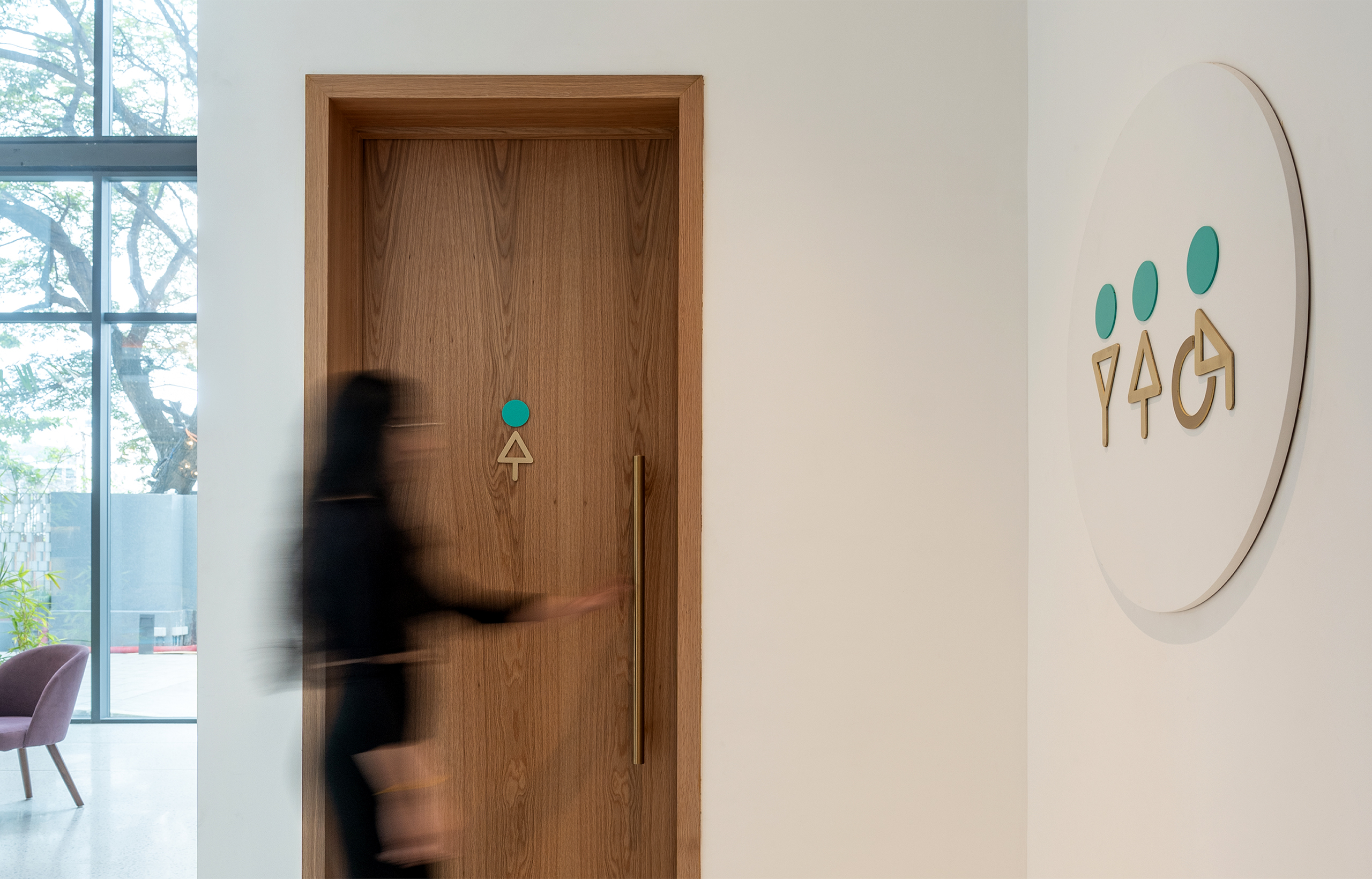
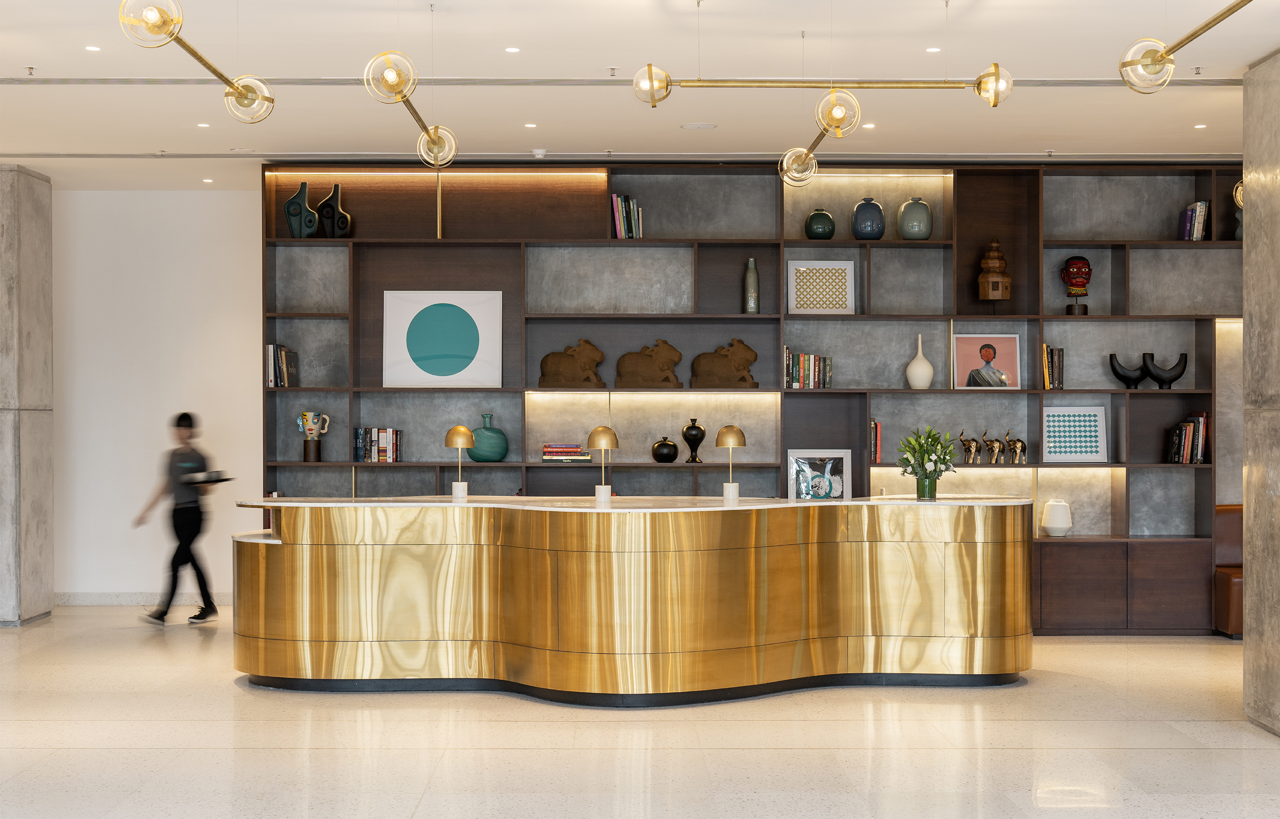
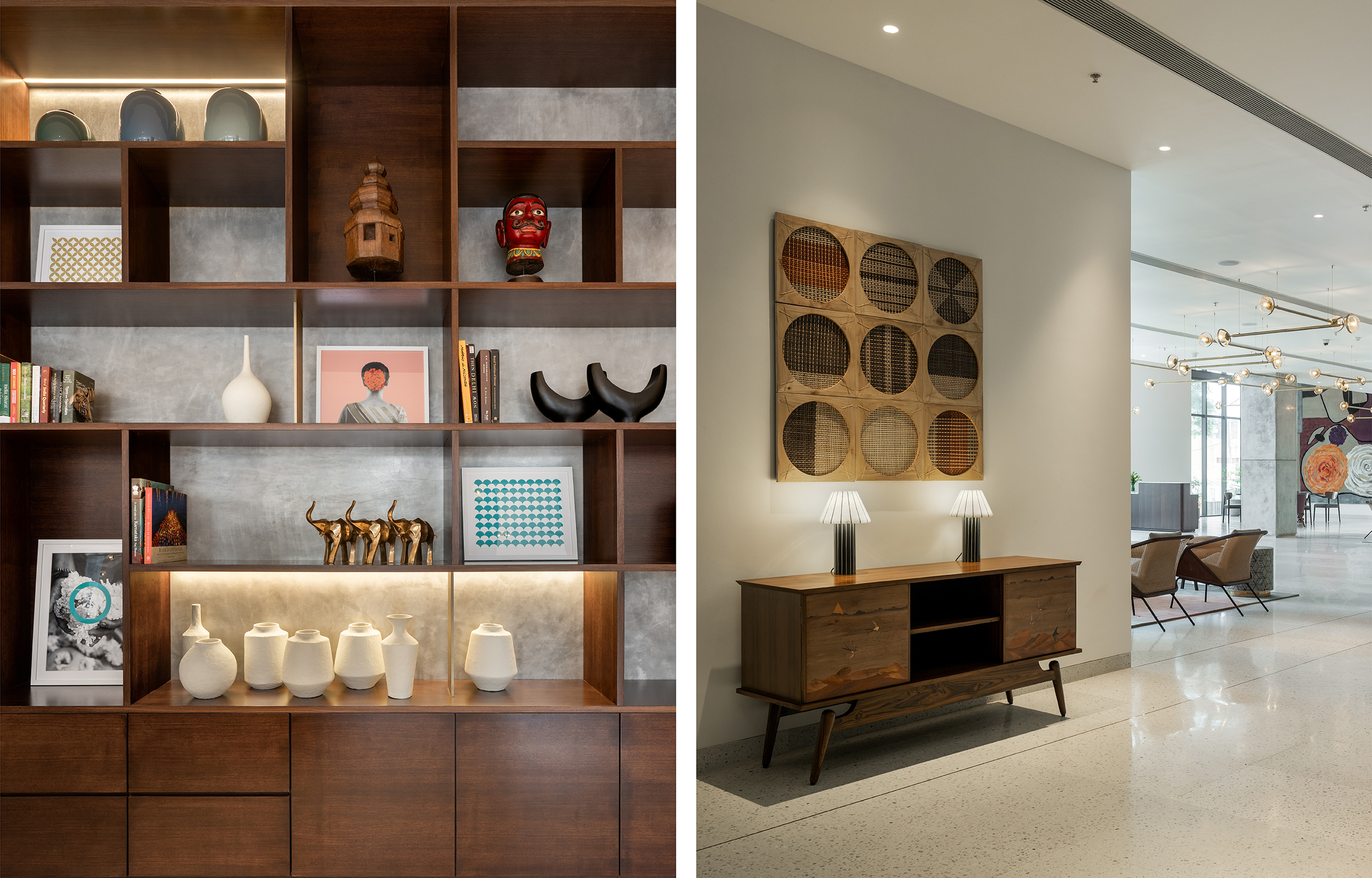
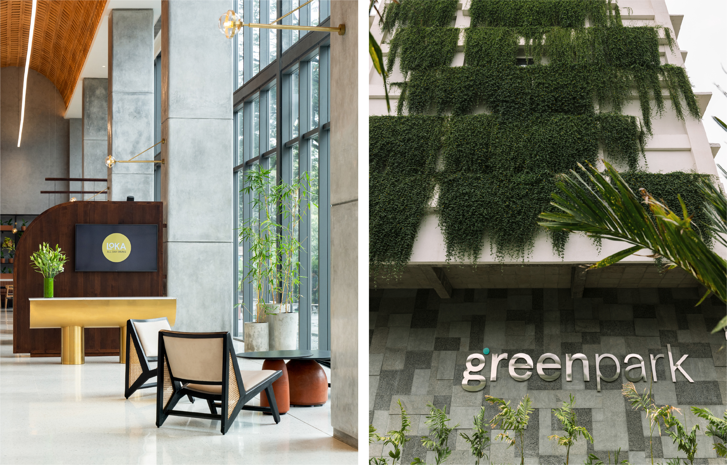
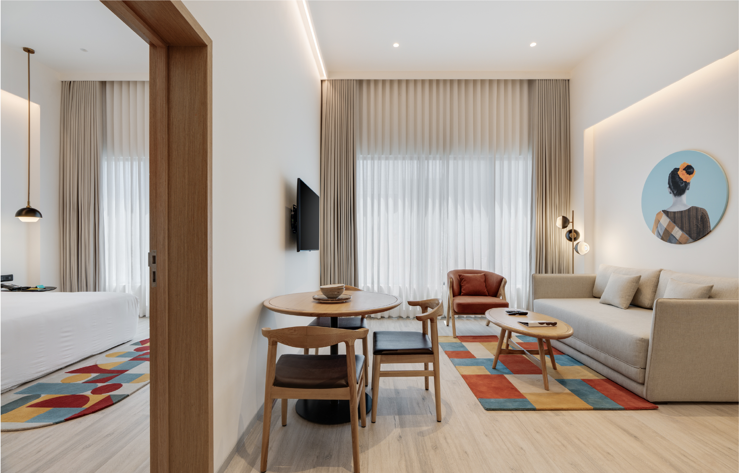
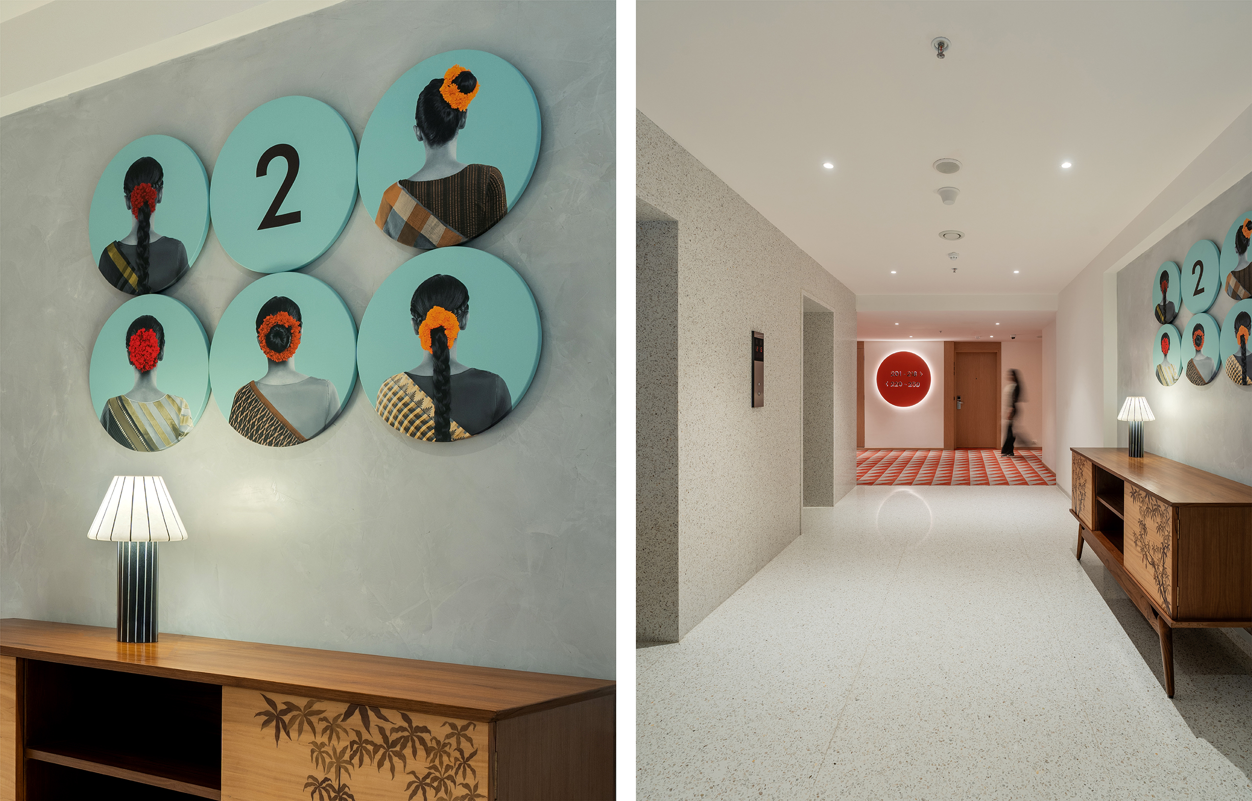
A key differentiator for Greenpark was its ‘India Modern’ sensibility — a distinct point of view rooted in cultural context. In contrast to the neutral aesthetics of global hospitality brands, the design language embraces local references with confidence and restraint.
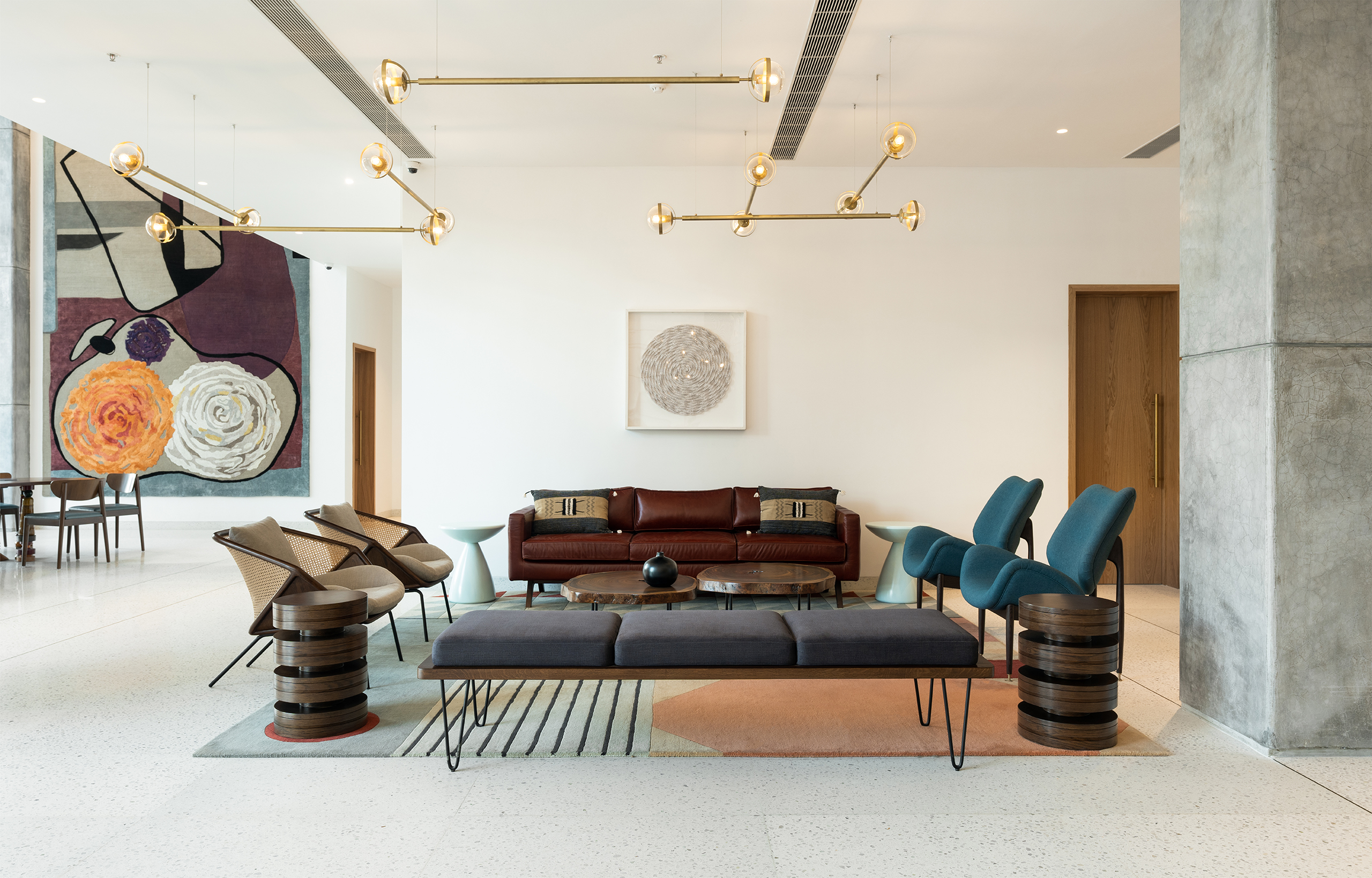
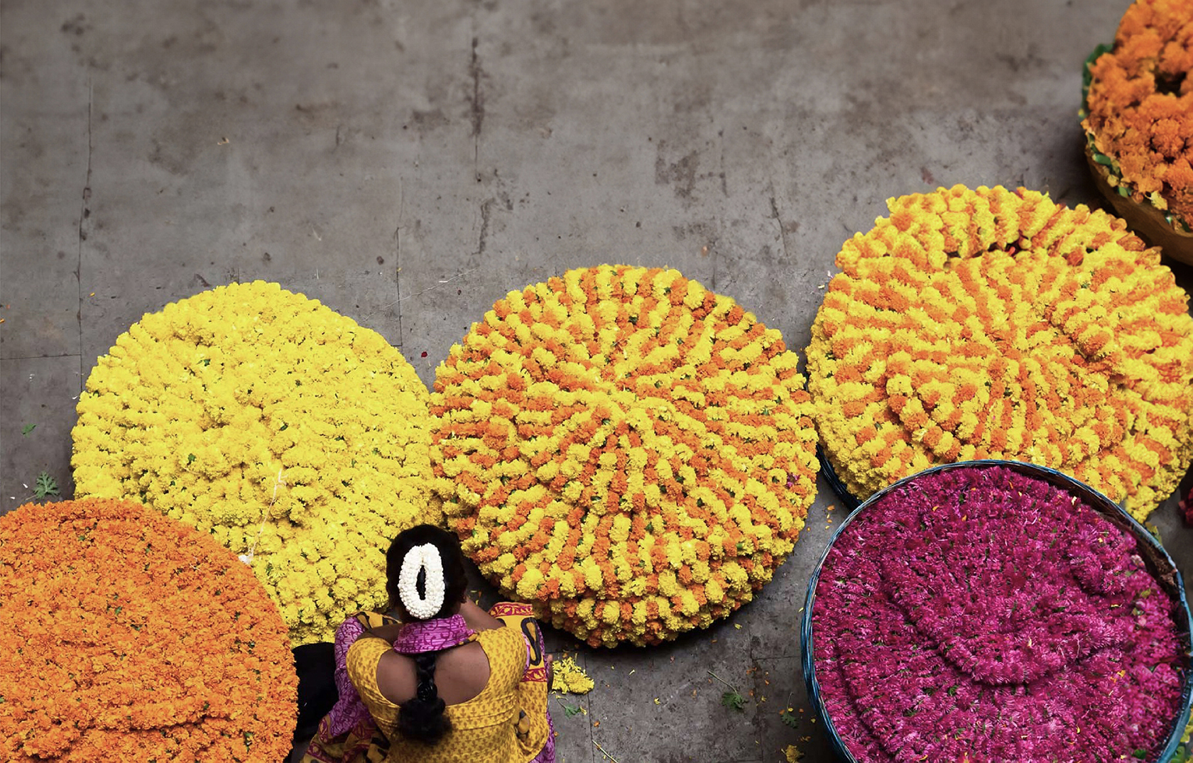
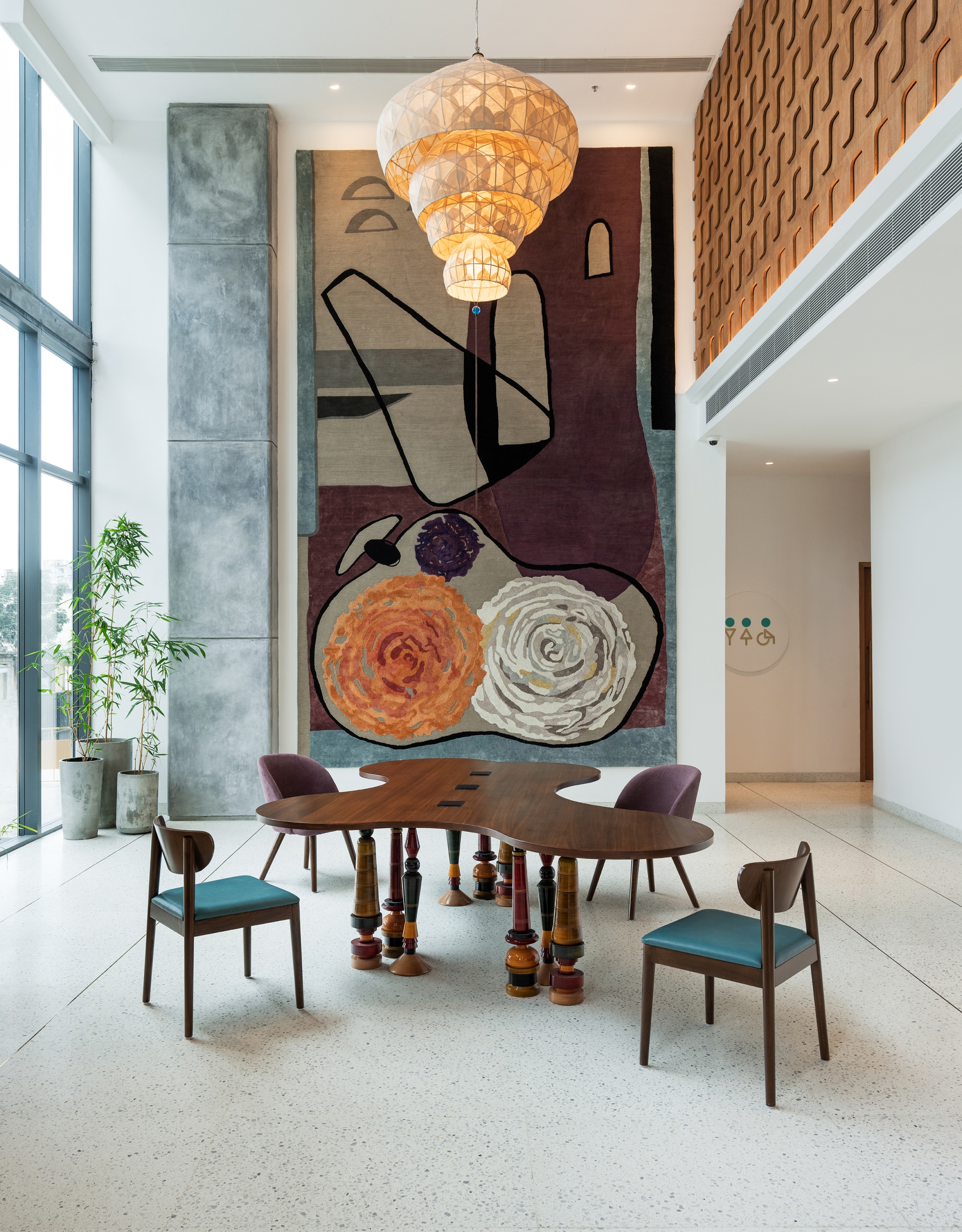
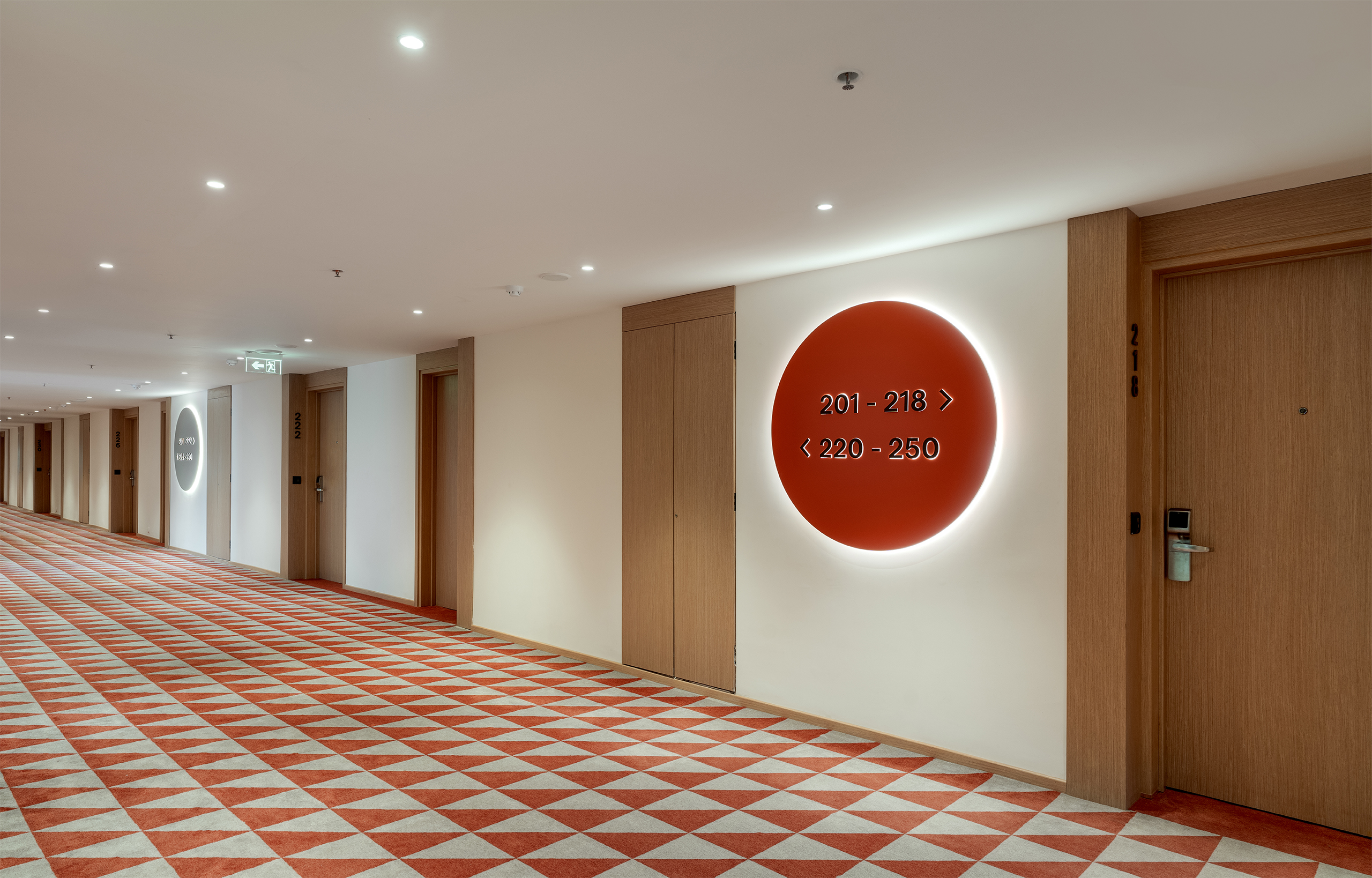
Environmental graphics and artworks draw from Bangalore’s cultural fabric. A dramatic lobby carpet anchors this approach — inspired by a cubist rug, it interprets the KR Flower Market through a geometric narrative. The triangular form traces the market’s footprint, arches echo its architecture, while circular baskets brim with marigolds and jasmine. Colour, texture, and geometry translate a sensory experience into a striking installation.
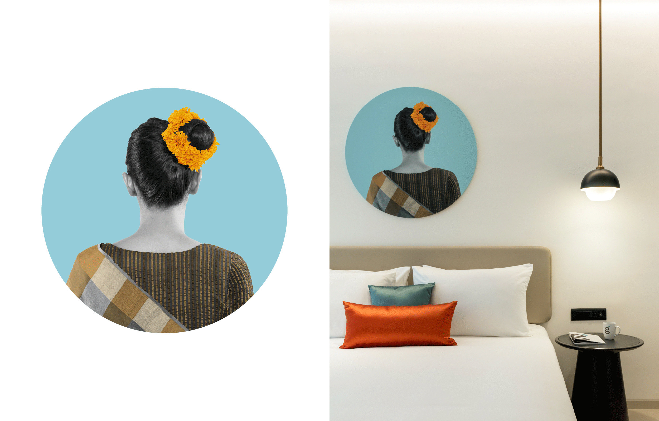
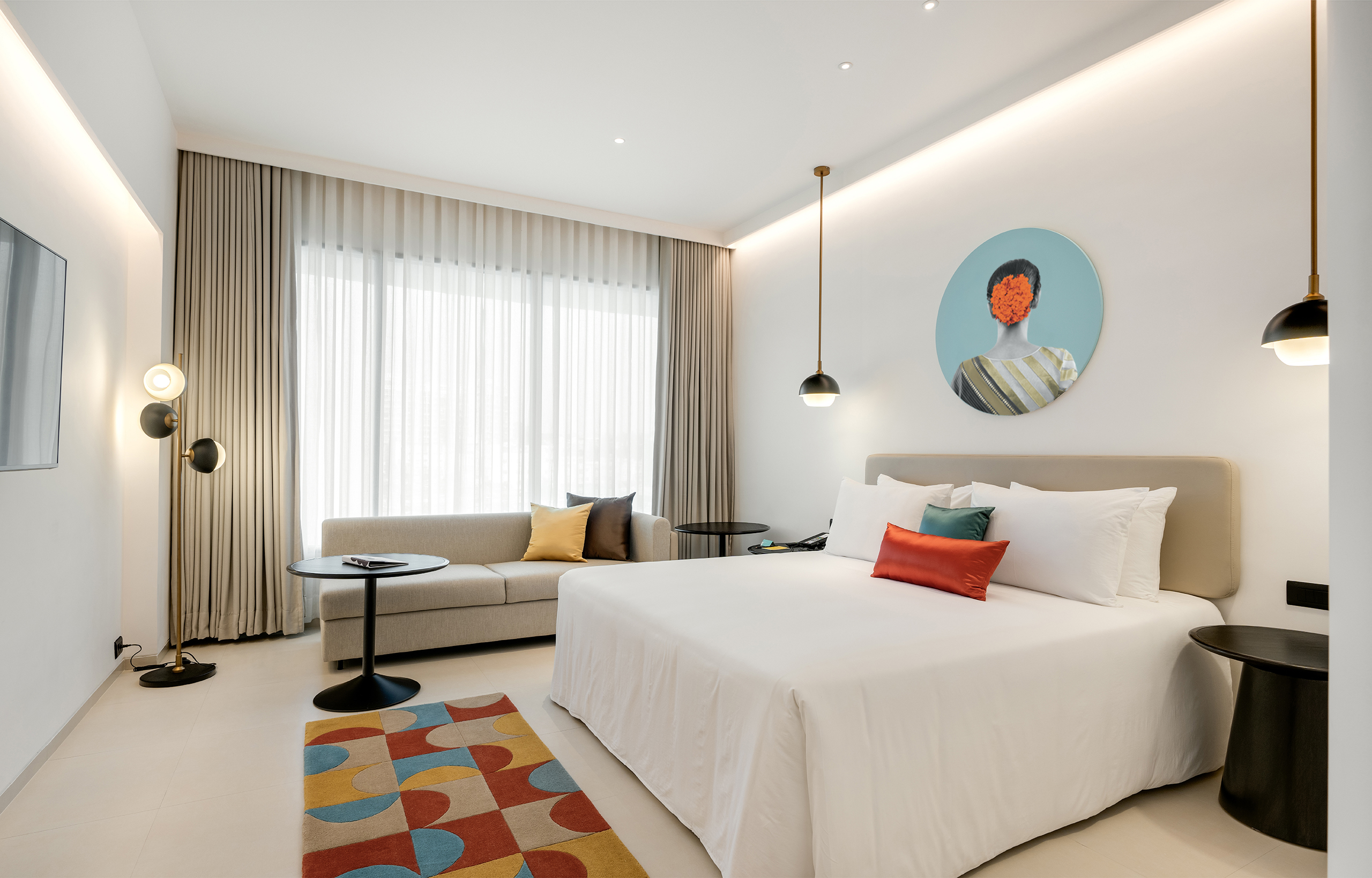
This floral, circular motif extends across the space — in signage, graphics, and artworks — while referencing the everyday ritual of malipus and marigold garlands adorning women’s hair.
Developed in close collaboration with Khosla Associates, the identity is seamlessly embedded into the interiors, creating a dialogue where graphic and spatial languages echo with quiet consistency.
IMPACT
Bridging personal hospitality, contemporary design, and cultural context, Greenpark’s new identity has been embraced by loyal stakeholders, while also resonating with modern travellers. Building on this robust platform, Greenpark is expanding its presence across South India — evolving from business to leisure hospitality, anchored in the promise of ‘Stay Special’.