Greenpark
Reframing a legacy hospitality brand for contemporary travellers
Brand Identity / Environmental Graphics / Print & Collateral / Web & Motion
Rebranding an integrated textile major for exponential growth: We partnered with Himatsingka to consolidate the brand’s legacy, gear them for continued expansion, and build a robust, global brand. A distinct and bold identity, the ‘Himatsingka Wheel’ reflects a dynamic company that is constantly moving forward, while the embedded ‘Star’ reflects the brand essence, Inspired Excellence.
Our design solution is precise, deep, and expansive, from a crisp and distinct brand mark that reflects the brand’s vision and essence, to a comprehensive roll-out plan including applications across print, digital, and environmental spaces.


Reframing a legacy hospitality brand for contemporary travellers
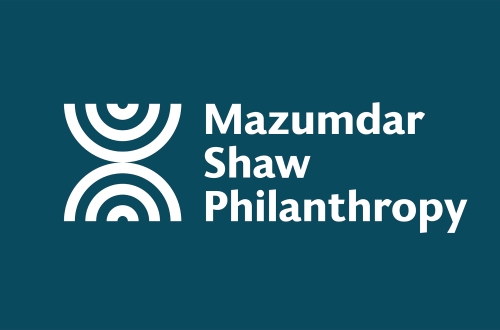
Branding a philanthropy for global impact

Branding a new museum and cultural hub

Crafting a new concept for Indian luxury
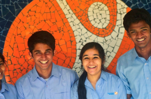
Reimagining a school for a new generation of learners

Shaping the Early Years

Rebranding GVK BIO to Aragen: Positioning India’s leading biopharma company for global expansion
Inventing Inventure
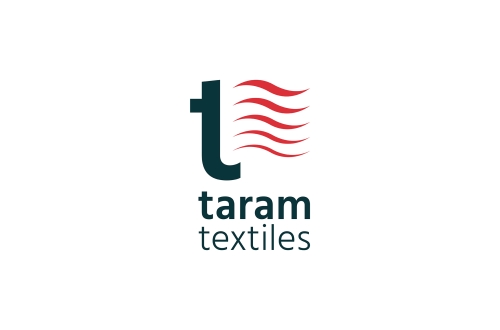
From Rajapalayam to the world — evolving a global textile brand
From legacy to change — branding a family office

Rapid response in the time of Covid

Building an enduring identity for India’s biotech pioneer

Taking a 100 year old business conglomerate into the future

Decoding the complex world of colour

Rebranding an established education institution

Branding a complete IB school

Branding an integrated real-estate company

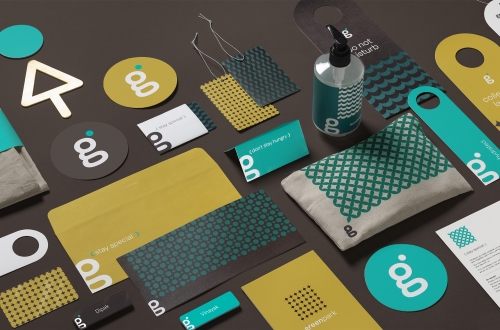
Feel Good Stays

Artful screens to fine crafted menus, branding a fine dining restaurant

Branding The Park’s pan-India poolside experience